


 Striking new colors and a refreshed look for a familiar image were unveiled today as the new Chilliwack Chiefs Hockey Club introduced its new logo.
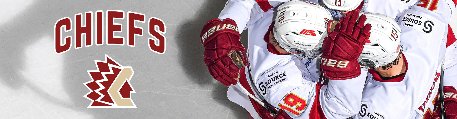
The identifying marks of the BCHL Club bear a striking resemblance to those of the former Chiefs organization, but this time with bold new colors and a new lettering font. The predominant colors of the logo, which includes the words Chilliwack Chiefs and the famous mock Indian Headdress, are crimson red, gold and white.
“We and the team owners put a lot of thought into the design in an attempt to recapture the spirit of the former Chiefs Club while clearly marking the arrival of a new generation of BCHL hockey in Chilliwack,” said Chiefs President Glen Ringdal in making the announcement.
“These are colors that have previously been associated with such teams as the Washington Redskins of the NFL and the University of Denver Pioneers and they closely mimic the colors of seats in Prospera Centre,” he said.
“We believe our new team uniforms bearing the logo which will be unveiled at the team’s first regular season game on Saturday, September 24, will be very well received by our fans. The logo and colors will be easily adaptable to Chiefs’ merchandise and apparel,” Ringdal stated.
The Club received help in the design from Chilliwack creative consultant Dan Mansell of Basecamp Creative.